Lets get one thing perfectly clear: This is not Lightroom, not even close. But it does have some nice tricks up its sleeve.
What we love about Lightroom on the desktop is its ability to organize, process and tweak a huge number of images in a comparatively short amount of time. There are a lot of other benefits, too. Like non-destructive editing of images, or the ability to quickly compare edits to similar images. But if I’m honest, the lynchpin feature is efficiency. Keywords, color labels, flags and collections create almost endless workflow potential. The adjustment brushes and tools can effect one, or many images, in a matter of seconds. But most importantly, It can all happen very fast, and I submit that is why we all love it so much.
So, naturally, this is what I expected from Adobe when bringing Lightroom to the iPad, albeit, with some limitations. I think Lightroom Mobile might really just be designed to make people want to use the desktop version more.
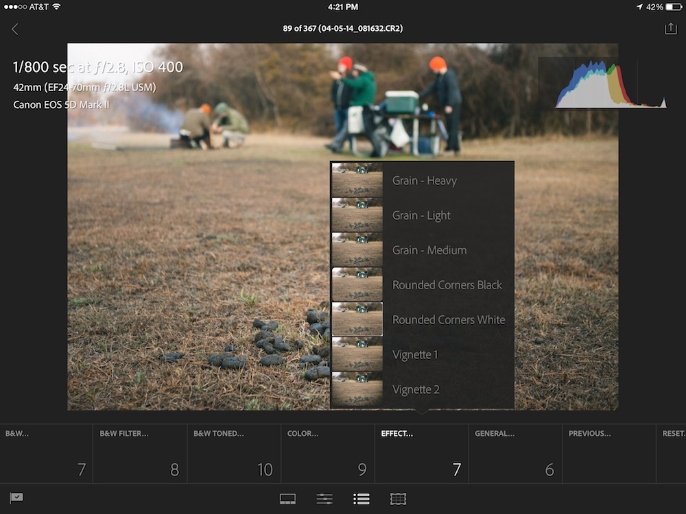
What we got so far is really not much more than any other run of the mill photo editor on the iPad. Namely, a lot of tacky presets and basic tools–like cropping and exposure. Very notably absent is any way to adjust multiple photos at once–a deal breaker for me, as you might remember from a few sentences ago. But amongst the disappointment, there is one feature that works very well, but is thus far frustratingly under-implemented: Cloud syncing Lightroom catalogs. First of all, the cloud synced catalogs seem to work flawlessly. Once the Lightroom catalog is set up for it, photos just start showing up on the iPad and edits to photos on either platform are almost instantly seen everywhere. I was really pretty excited to see that.
But as soon as the happy haze faded, I started wondering whether this cloud syncing magic might be able to work between two different computers who both need to see the same images. Well… it doesn’t. I was deflated. But I still wanted to see what Lightroom Mobile had to offer. And it might just have a place, even in this have-some-shame-bare-bones release. It comes in the form of Picking & Rejecting.
One of the organizational tools on the desktop is the ability to flag images as ‘picked’ or ‘rejected’. It’s simple and it makes sense. Lightroom Mobile makes this process quite efficient. Just swipe up to ‘pick’ an image, and swipe down to ‘reject’ an image. While using the app, I found this part of the process did go faster. But probably not by enough to introduce an iPad detour to my workflow. It would be great for the entire organization process to happen on the iPad. But as of now, keywording and color labels are not supported.
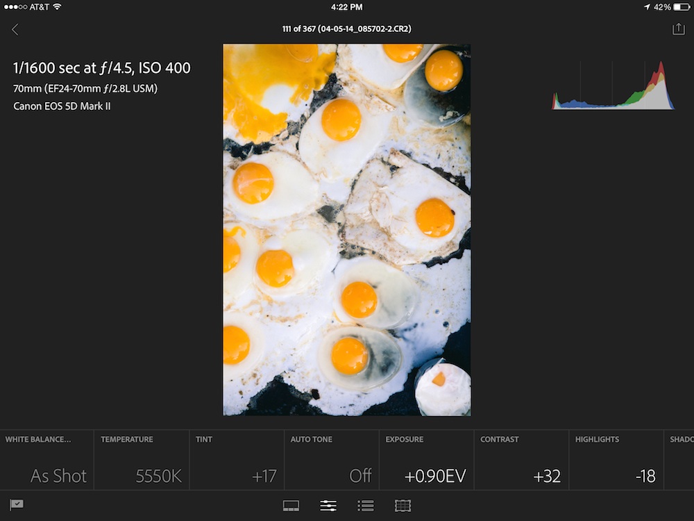
It’s not worth much to go over the editing of images. It’s painfully inefficient. Edit one image at a time. From scratch. Every, single, image. And, two crucial tools are missing–tone curve and split toning. So, getting your rough adjustments done on the iPad in any kind of reasonable amount of time is pretty much out of the question.

You can see the adjustment options along the bottom. Each one needs to be tapped once before adjustments can be applied.
This is just a first release for Lightroom Mobile and they did prove a certain concept. The cloud syncing works really well. Picking/rejecting images on the road could certainly be useful. But there’s just so much missing. And really, that’s a touch insulting since Lightroom Mobile is only available to Creative Cloud subscribers at a minimum of $10/month. So… you’re kind of paying for it and it’s just not good enough to pay for. Maybe next release.
UPDATE: After further use, it’s become clear that Lightroom Mobile is only capable of syncing with one catalog. Unfortunately, since my business deal with hundreds of thousands of images and multiple catalogs, Lightroom Mobile is effectively useless for my purposes. I’ll continue to keep my fingers crossed for improvements in the future.


Recent Discussion